Get in touch
Get in touch
Groene en Gezonde Verbinding
Groene en Gezonde Verbinding
Groene en Gezonde Verbinding
(Wordmark design)
(Wordmark design)
Identity Design
Identity Design
(Project description)
(Project description)
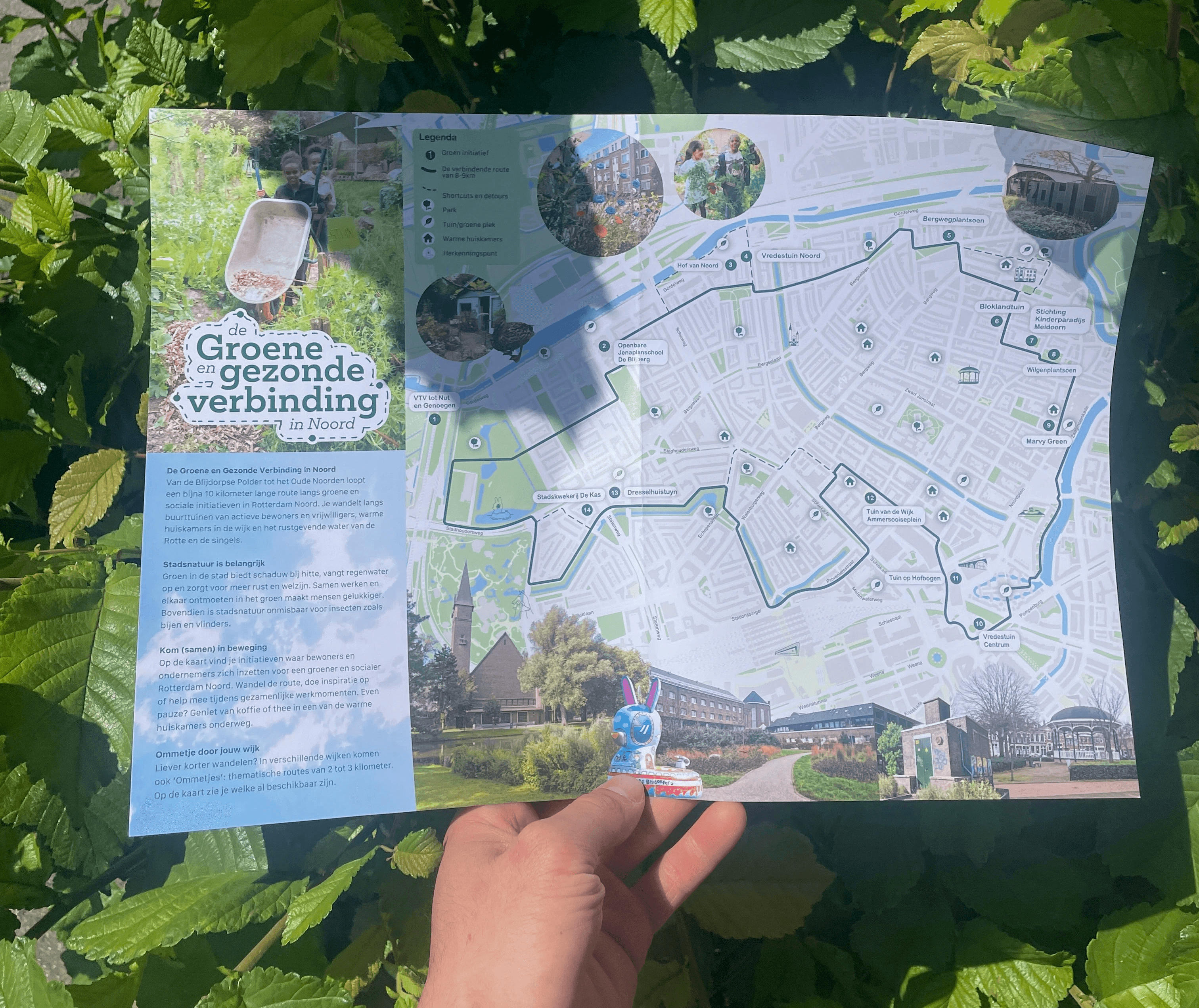
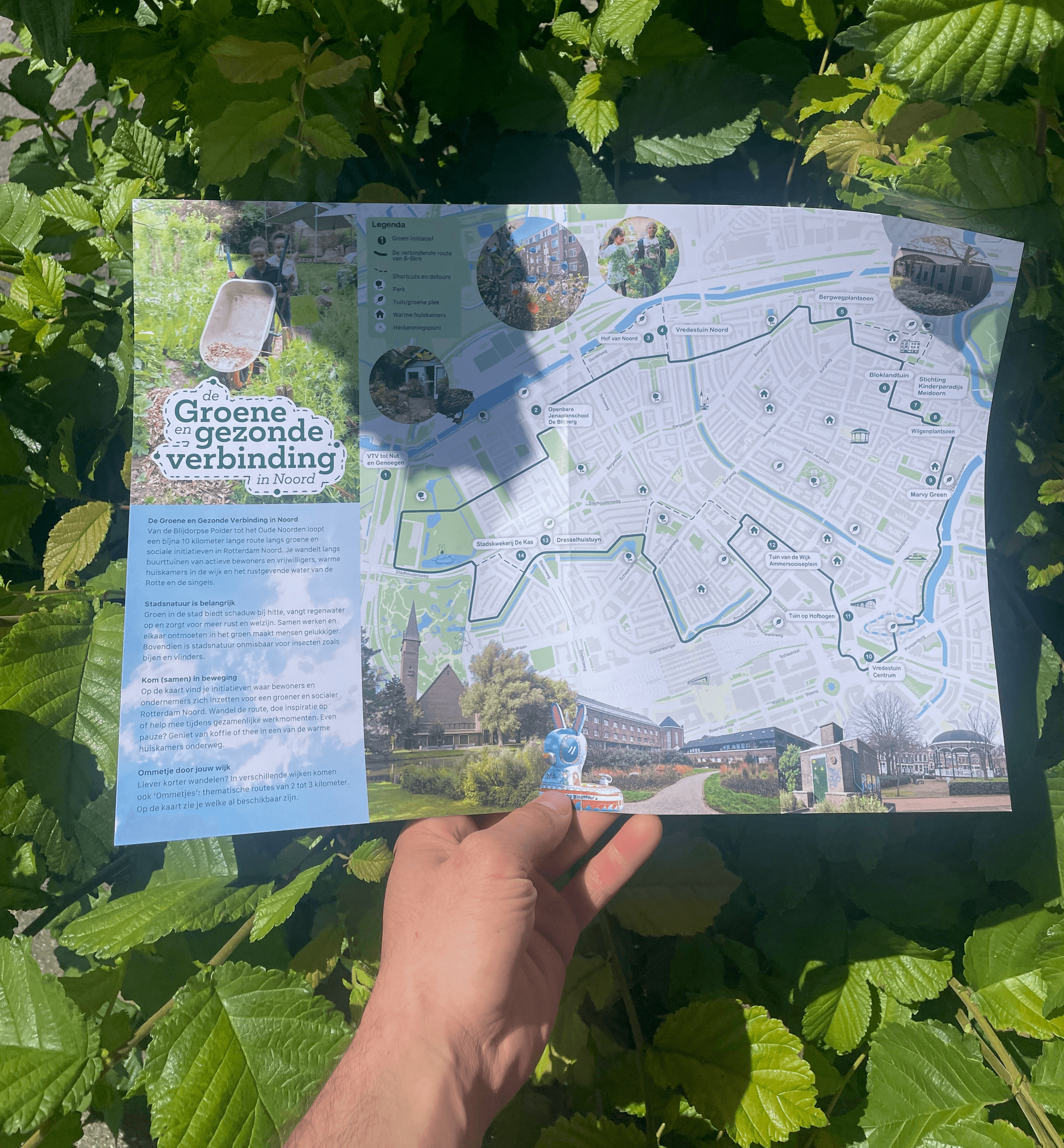
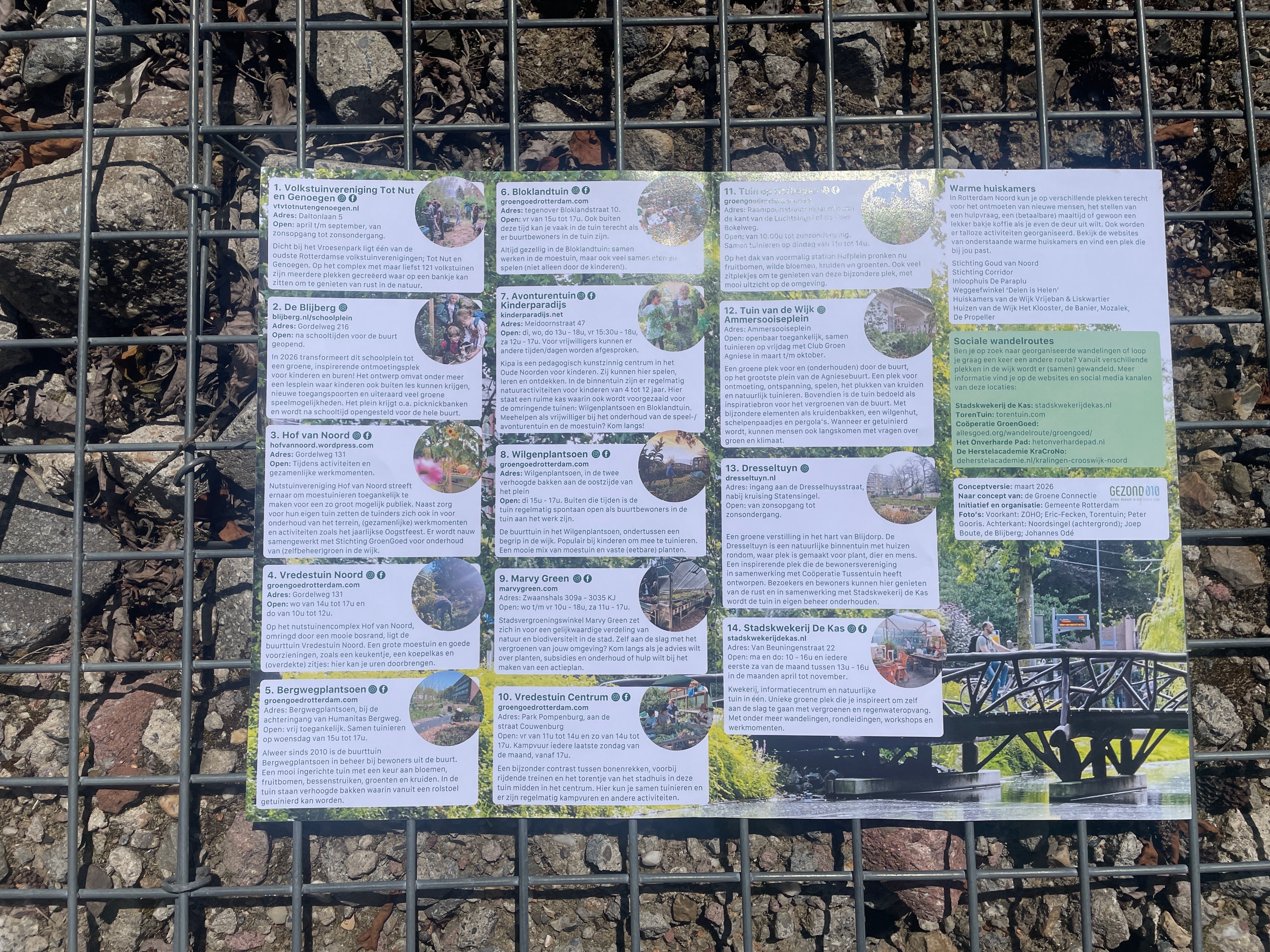
In collaboration with the city of Rotterdam, Lieke van Wilpen, Meike Sloover, Mariëtte Scholtens and Marijn Scheers, we designed a walking route map connecting various green spaces in Rotterdam Noord with a walking path.
(Design challenge)
(Design challenge)
Every year, the the city of Rotterdam collaborates with green initiatives around the city to compile a collection of happenings across its various neighborhoods with a walking path to connect them all.
This year, through my ongoing partnership with Marvy Green and the Groene Connectie, I had the opportunity to contribute to the 'Groene en Gezonde Verbinding' in Noord.
My contributions to the initiative included the information design of the map and coolest of all: the wordmark.
Every year, the the city of Rotterdam collaborates with green initiatives around the city to compile a collection of happenings across its various neighborhoods with a walking path to connect them all.
This year, through my ongoing partnership with Marvy Green and the Groene Connectie, I had the opportunity to contribute to the 'Groene en Gezonde Verbinding' in Noord.
My contributions to the initiative included the information design of the map and coolest of all: the wordmark.

(The process)
(The process)
I coordinated with stakeholders to establish a clear picture of the project's goals and priorities.
The map was developed with accessibility and readability as the primary focus, working within existing visual guidelines.
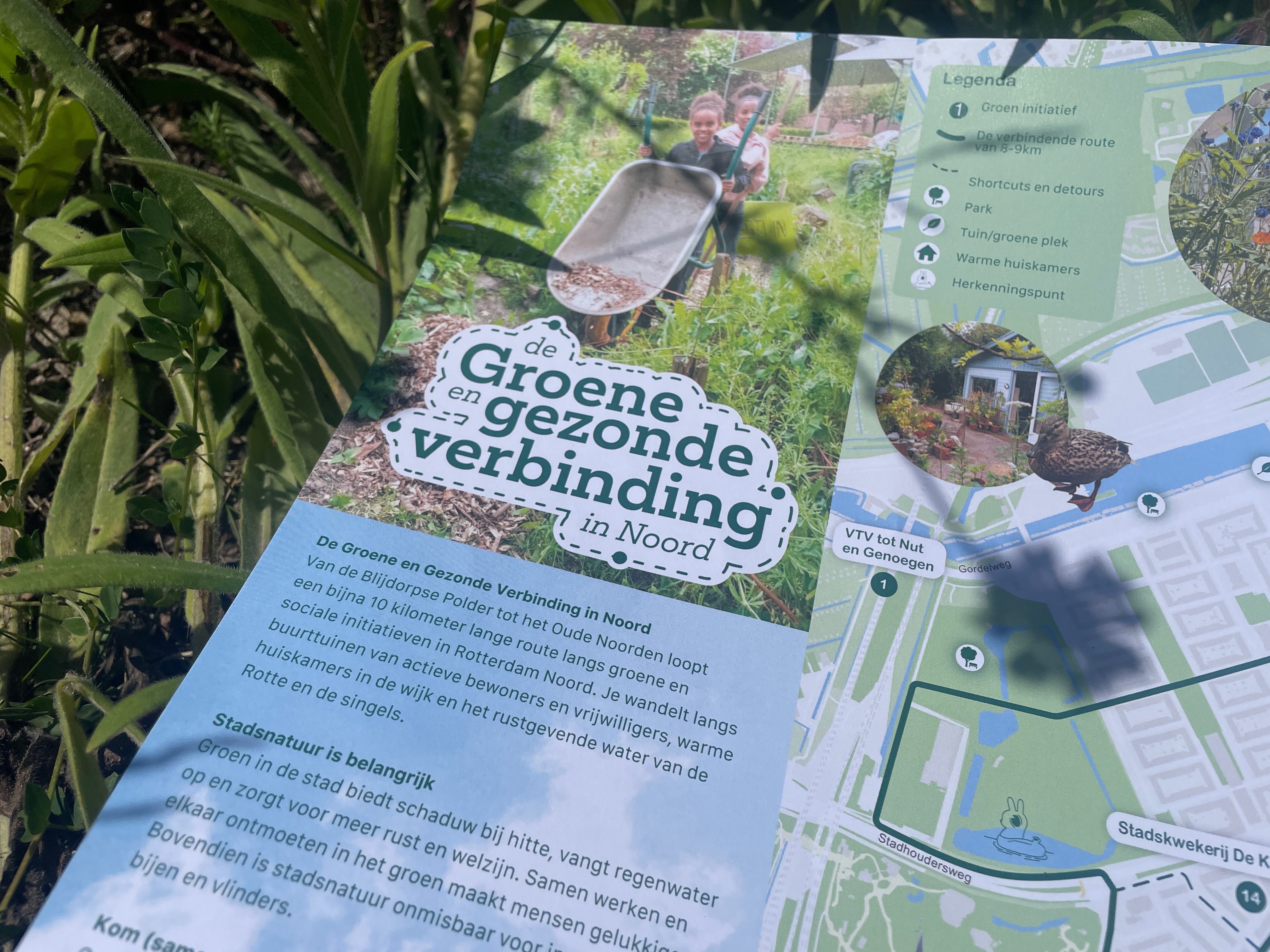
The initiative's identity was explored typographically: the aim was to communicate as much as possible through an inviting, bold, and expressive type choice, further supported by dotted lines referencing the walking path. Together, these elements create a visually distinct layout and a recognizable brand for the project.
Both designs were refined through iterative feedback with stakeholders, keeping all parties aligned until a consensus was reached on the final result.
I coordinated with stakeholders to establish a clear picture of the project's goals and priorities.
The map was developed with accessibility and readability as the primary focus, working within existing visual guidelines.
The initiative's identity was explored typographically: the aim was to communicate as much as possible through an inviting, bold, and expressive type choice, further supported by dotted lines referencing the walking path. Together, these elements create a visually distinct layout and a recognizable brand for the project.
Both designs were refined through iterative feedback with stakeholders, keeping all parties aligned until a consensus was reached on the final result.

(Key takeaways)
(Key takeaways)
This project reinforced how rewarding it is to design for real community impact. Seeing the work printed and used by people in Rotterdam was a good reminder of what design can do beyond the screen. Working within an environmentally conscious initiative pushed that further. From a craft perspective, it sharpened my approach to finding a visual language that feels both functional and characterful within tight budgets and guidelines.
This project reinforced how rewarding it is to design for real community impact. Seeing the work printed and used by people in Rotterdam was a good reminder of what design can do beyond the screen. Working within an environmentally conscious initiative pushed that further. From a craft perspective, it sharpened my approach to finding a visual language that feels both functional and characterful within tight budgets and guidelines.
(Gallery) hold shift and scroll :)

Rotterdam, the Netherlands
1:31 PM
Reach out!
Tap in!
Say hi :)
Reach out
Let's connect
Rotterdam, the Netherlands
1:31 PM
Reach out!
Let's connect
Reach out
Say hi :)
Tap in!