Get in touch

Get in touch

Mildred

Mildred

Mildred

(Brand identity for bookkeeping application)

(Brand identity for bookkeeping application)

Multidisciplinary

Multidisciplinary

(Project description)

(Project description)

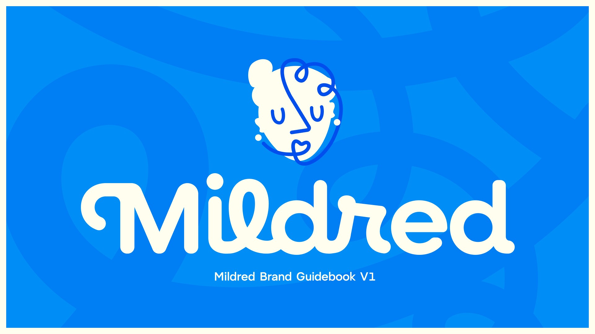
Mildred is an AI-powered bookkeeping assistant built around a simple but powerful idea: instead of waiting on clients to send receipts and financial materials, Mildred does the chasing. Confident, unhurried, and armed with decades of imagined experience, she has mastered the follow-up, the firm reminder, and the kind of quiet authority that needs no explanation.

The brief was to build a brand as singular as the product, something weird, expressive, and completely unlike anything else in the fintech space. Inspired by the surrealism of Picasso and the fine art of his era, the result is a mascot driven identity built on single line drawing, a hyper-specific visual language that makes Mildred immediately personable, emotive, and recognizable.

(Design challenge)

(Design challenge)

The central challenge was one of economy: communicating as much as possible through as few lines as possible. Picasso's single-line technique is deceptively simple, and translating that approach into a functional, expressive brand mascot required finding the subtle harmonies between curves, negative space, and supporting shapes.

Every line had to carry weight. Working within the fintech category added another layer, creating something that felt genuinely strange and expressive in a space that tends toward the safe and the sterile.

The central challenge was one of economy: communicating as much as possible through as few lines as possible. Picasso's single-line technique is deceptively simple, and translating that approach into a functional, expressive brand mascot required finding the subtle harmonies between curves, negative space, and supporting shapes.

Every line had to carry weight. Working within the fintech category added another layer, creating something that felt genuinely strange and expressive in a space that tends toward the safe and the sterile.

(The process)

(The process)

The concept arrived before the first client meeting. Excited by the brief, the idea began forming in the days leading up to it, sketched out on the wall of an elevator. When the client saw it, the direction was set almost immediately.

From there, the mascot came first. Getting her shape right meant extensive study of Picasso's work and a wide range of other single-line artists, followed by rounds of sketching and iteration, chipping away until the right harmony emerged between the lines and the forms they described.

The color system followed, built to support the mascot's final look. Since the sketches were all in black and white, finding colors that honored the shape harmonies while representing the brand took significant experimentation.

Typography and supporting brand elements came after, each decision informed by what the mascot had already established. The process was rounded off with a full brand guidelines document.

Throughout, the client was a trusted sparring partner, bringing ideas that genuinely shaped the direction while giving full creative latitude to push the work somewhere truly unusual.

The concept arrived before the first client meeting. Excited by the brief, the idea began forming in the days leading up to it, sketched out on the wall of an elevator. When the client saw it, the direction was set almost immediately.

From there, the mascot came first. Getting her shape right meant extensive study of Picasso's work and a wide range of other single-line artists, followed by rounds of sketching and iteration, chipping away until the right harmony emerged between the lines and the forms they described.

The color system followed, built to support the mascot's final look. Since the sketches were all in black and white, finding colors that honored the shape harmonies while representing the brand took significant experimentation.

Typography and supporting brand elements came after, each decision informed by what the mascot had already established. The process was rounded off with a full brand guidelines document.

Throughout, the client was a trusted sparring partner, bringing ideas that genuinely shaped the direction while giving full creative latitude to push the work somewhere truly unusual.

(Key takeaways)

(Key takeaways)

This project feels like a culmination. A more mature process, a more confident execution, and a clearer sense of how earlier work and aesthetics had been building toward something like this. The freedom to make something genuinely weird, and a client willing to go there, made it possible to produce work that feels entirely its own.

This project feels like a culmination. A more mature process, a more confident execution, and a clearer sense of how earlier work and aesthetics had been building toward something like this. The freedom to make something genuinely weird, and a client willing to go there, made it possible to produce work that feels entirely its own.

(Gallery) hold shift and scroll :)
Groene en Gezonde Verbinding

Groene en Gezonde Verbinding

Groene en Gezonde Verbinding

Rotterdam, the Netherlands

8:05 PM

Reach out!